
Scott Smith, Principal, DFFRNT
In an increasingly distracted world, many users don’t have the capacity for long focus. In website usability testing, we see the negative effect of distractions.
Website users don’t always need lots of options to pick the best one. They need choices that are easy to make.
Let’s pretend you are going out to dinner. Restaurant A has a menu with 200 options. Reading through this menu to make a selection probably feels daunting, time-consuming, and like a task that might kill your appetite.
Restaurant B has a 15-option menu, cleanly printed in readable font with clear ingredient descriptions. No bells and whistles, just the information you need to make a quick, informed, and more satisfying decision. The same applies when your users try to accomplish tasks on your website.
Distraction stops your visitors from getting things done. It is a significant source of usability issues across many usability testing projects. Like the example above, distraction often happens because a website is trying to do too much: too many options, links, text, or images. When every piece of information is helpful, nothing is.
What does distraction cost you? In website usability testing, we see lots of time wasted by distractions when people take too long on tasks or, worse, give up. Users come to your website to accomplish tasks. If distracted, they can lose focus or leave the site altogether.
If this happens every time someone visits your website, distraction is directly impacting web task performance, your level of customer service, and your bottom line.
When people switch their focus to a different task, they leave behind a “residue.” Their brain keeps working on both tasks, and that can impact productivity. It is essential to enable the focus people do have on their primary task. Anything that diverts attention from the user’s primary task is a distraction. Understanding how the brain pays attention to things can help you make your user more successful in accomplishing what they came to do.
Gloria Mark at the University of California at Irvine says workers change tasks every three minutes on average. Once distracted, they take nearly a half-hour to resume the original task. In an increasingly distracted world, many users don’t have the capacity for long focus. This means capturing the focus people do have is essential to make your service user-friendly.
Dr. Sophie Leroy at University of Washington coined the term “attention residue” for this cognitive constraint. She observed in her research that when people switch from their primary task to another, they don’t forget about the primary task right away. That makes it harder to pay attention to the second task. This not only affects how well people work, but also how creative people are, and how happy they feel.

“People experiencing attention residue after switching tasks are likely to demonstrate poor performance on the next task.”
— Dr. Sophie Leroy
So how can you win the war on distraction? Tailoring your web resources to enable top tasks can help. That means removing distracting links, buttons, advertisements, or menu items. De-clutter the primary scanning area. Make it easy to notice one button or link as the primary action. Avoid flashing, blinking, etc. Keep improving your understanding of users, and their goals and context. If you can solve your distraction problems your website can become the critical tool you hope it can be, by helping people stay on task.
Here are some strategies you can implement to win your battle against distraction:
How do you prioritize top tasks and get rid of distracting steps?
Do you ever feel like you’re jumping through so many hoops to complete a task that you lose sight of what you were trying to accomplish in the first place? This same principle applies to your website’s user experience. People get distracted when they must navigate through many pages just to complete a task. Why? There are a few reasons.
The longer time or more effort a task takes, the more likely a person is to:
- Be distracted by someone nearby
- Lose focus
- Be interrupted
- Browse other (distracting) web pages if it isn’t obvious
Let’s look at, for example, the process of registering for a new business number on the Canada Revenue Agency (CRA). It takes 7-10 steps from the CRA main page just to begin entering data into fields.
Business owners must do this task a couple hundred thousand times per year. No wonder 18% of phone calls to CRA are about business number registration, most of which are by third-party intermediaries who profit by explaining it to business owners. Too many steps invite distraction. This adds a burden to already-busy people.
To fight distraction caused by too many steps or clicks, you can:
- Remove irrelevant steps. It seems obvious, but many websites lose users by including steps that don’t help the end goal of accomplishing a top task. Top task paths are like arterial highways. Get people on their way. Don’t slow them down with lots of choices.
- Help people move forward. Contextualize navigational links and menus as they click.
- Make sure visitors can accomplish most tasks in two minutes or less. Ensuring excellent task performance prevents all kinds of problems.
How can you make your website links more visible?
Visitors start their journeys to your website on task. Anything that causes them a delay is a distraction. Providing an overabundance of links takes people time to scan and may cause them to scan even faster, missing key details or the link they came looking for.
Common link formatting and design errors found on websites include:
- Too-long lists of links
- Links that are not descriptive
- Unclear or irrelevant link categories
- Hidden links or links embedded in paragraphs.
You will misdirect your users to click any links that are even remotely related to their task (rather than the one that will help complete it).
Link placement can result in a different kind of distraction. A link outside a viewer’s logical scanning area or off to the right can take a long time for people to notice.
If links or images look like ads or spam, people will also avoid them.
Here are some ways to fight distraction caused by links that are not easy to see:
- Put links that support top tasks in visible places.
- Use bullet points! These put vital links in your users’ primary scanning area. That way, they can scan for what they need when short on time.
- Don’t use distracting graphics for links to top tasks.
- Don’t make your users do unnecessary work. Too much time spent scanning around the page for top task links will frustrate and distract your users.
- For further reading, see “Four strategies to improve website usability.”
Avoid links that are too similar
What’s wrong with the picture below?
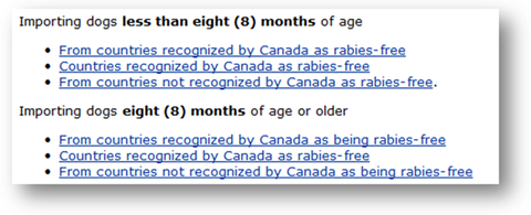
The links and bolded text seem repetitive, right? If your links contain repeating text, they become difficult to quickly scan and differentiate, making it hard for people to scan for unique words.
When your page titles are too similar, and your link text is not uniquely descriptive about what the user can do, they will continue scanning. If most links seem to do or link to the same thing, the user will wonder what to do, may go back a page, or abort their task completely.
What can you do to fight distraction caused by links that are too similar?
- Analyse search terms for each top task.
- Optimize landing pages to ensure links use the words people scan for and monitor top tasks to improve search performance.
- Get rid of link text or menu items that don’t relate to top tasks for that landing page.
- Make sure top tasks can begin on the landing page without guessing.
Don't let your links make empty promises
A link works well if it creates a consistent expectation for all end users and then fulfills that promise. When a link creates false or ambiguous expectations, end users are disappointed. If what you promised in your link text isn’t delivered on the page they just clicked through to, your user will stop and wonder if they got to the wrong place.
When people click the “Register Now “button, they expect to register. Now.
They’re disappointed if they have to click through several more pages before they can begin the registration process. You can see extra steps like this in the Canada Revenue Agency’s Business Registration process or many university websites’ “Apply Now” links.
How can you fight distraction by following through on the promises your links make?
- Reword your links to match user expectations as they do top tasks.
- If you offer links to refine a search, eliminate any unrelated to the search terms.
How do you avoid distracting marketing?
Selling products or services may be a core function of your website. After all, that’s your aim as a business owner. But inserting marketing at the wrong place and time decreases website usability and can cost you the sales you are trying to make.
When a user is on-task, they are in a focused state. Providing marketing or sales links at the wrong point in the user journey creates distraction. Wait until they finish their task to ask for attention and show marketing links.
Graphical ads, for instance, often make pages load more slowly. For example, one internet provider placed graphic ads on its website suggesting that customers upgrade to high-speed internet.
Ironically, the fancy image on that page itself had an 18-second load time. In an age of high-speed graphics, 18 seconds to view a key landing page is so long that it invites distraction. At that rate, you’re lucky if your users stay around to view the page at all.
Nowhere is this more obvious than in e-commerce. And it can impact your bottom line as well. Let’s look at an A/B test of two Dell pages:
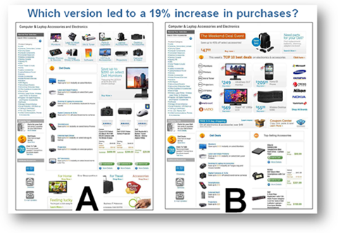
Version B had links to The Weekend Deal Event and Top 10 Best Deals at the top of the page. Version A had product-category navigation at the top instead. It may seem more logical that ads or sales copy would benefit sales. But the version B design actually distracted from sales, leading to decreased revenue of 19% compared to version A.
The special deals were so unrelated to end users’ tasks and sufficiently distracting that they lost sales! When promotions are not focused on the functions a user is trying to accomplish, you can lose your audience and take a hit to your bottom line.
How can you avoid losing your customer’s attention to marketing links?
- Gather hard data, not opinions, to defend key landing pages and paths for support of top tasks. Although it may seem counterintuitive (more sales pushes should lead to more sales, right?), letting the numbers speak for themselves and adjusting accordingly means you are building your page based on what your end users are actually doing, not what you think they should.
- If you must show ads, only display ads related to the task. Can you use creativity to incorporate the ads into the task in a way that is not distracting? This is something you should take the time to test out. Website usability testing will help you gain a clear path of what does and does not work from a user perspective.
How can cognitive bias impact your users’ focus?
When beginning to implement these solutions, one dangerous trap we can fall into is cognitive bias. In design thinking, we mean systematic errors in thought— how our brains take shortcuts to process excessively complicated or distracting information.
Cognitive bias often reinforces existing thoughts or feelings we have about the world, for instance, in the case of confirmation bias. So how does poor design cause the cognitive bias that can create distracting user experiences?
For instance, some of our clients use work-friends to do user acceptance testing. The risk is that research with the in-crowd can suffer from selection bias: Not selecting the best possible candidates to survey or test in your research. Selection bias could, unfortunately, doom an experiment right from the start! Behavioural research starts with human actions. If you’re not testing the best sample group for usable results, your services will likely continue to frustrate those you aim to help.
Measure and manage top tasks to avoid distracting your web visitors
So how are all these solutions related? The root cause of all the above is failing to manage top tasks correctly. Measuring task performance is an excellent way to manage tasks. But even on large web teams, often no single person is responsible for performing top tasks. Individuals are accountable for budgets, projects, software or hardware, etc.
Measuring users’ performance on top tasks is not typically assigned to an individual. The result? Top tasks don’t get managed. The lack of management causes organizational confusion on what the top tasks really are and creates distracting web design that prevents them from being accomplished.
When someone on your team takes ownership of top task performance measurement, they are motivated to fix things that distract end users from completing top tasks.
To prioritize top task performance measurement, you can:
- Perform an expert usability evaluation. This is a good, cost-effective place to start. It will help you identify burning usability issues and give you high-impact recommendations. If you’re wondering how to test usability of a website, an expert can help you come up with a website usability checklist that you can refer to down the road to make sure you’re still keeping up with the best usability practices.
- Test for usability. Usability testing for websites helps improve task performance. Plan for it during a significant redesign and as day-to-day practice built into your business model. Usability testing will let you see where distractions affect your task completion rate.
- Identify your tasks. This will quantify your visitors’ top tasks and prioritize the important words for your web visitors.
- Analyse the context of users’ tasks. Talk to your contact centre people. Discuss top search terms with a lead agent to brainstorm what users might be trying to do.
- Use a task performance indicator. If you’re not sure how to test usability of a website, a task performance indicator can be a good start. It tests your top tasks with real users in quantitative usability testing and gives you benchmark task completion rates and time on tasks that you can use in day-to-day top task management. You can iteratively and continuously improve your user experience based on the results.
Using any of these steps individually or all together will help you in your quest to win the war on distraction.
Still trying to figure out where to start? There is always room to approach website usability testing for better top task management and eliminate distraction using a DFFRNT solution. Say hello and message us for the right approach to minimize distractions on your website.