The Treasury Board’s web standards specify that all government of Canada web properties need to be accessible, interoperable and usable. In this way, it has effectively mandated usability testing.
But the Treasury Board guidelines do not specify what constitutes usability testing, so there are many lesser forms of user testing being embraced. There is tacit agreement in government circles that unmoderated remote user testing is sufficient to meet the guidelines.
While there is room in the toolbox for remote, unmoderated testing, it shouldn’t be the only tool available. In the hands of a capable design professional, this type of testing can be useful, but in the context of federal government service design, it sets the bar far too low.
What is arguably worse, the mandate for user testing takes the focus off user-centred design and other ways of incorporating user input earlier in the development process.
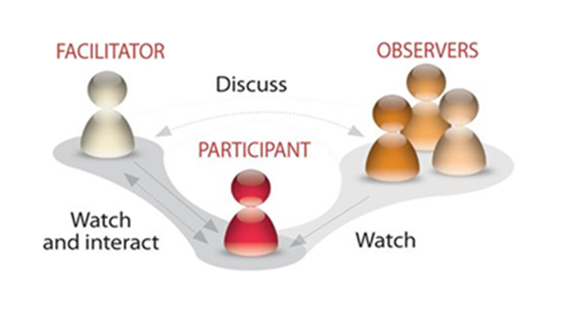
Even the government’s “guide to testing methods” on the Canadian Digital Service web page greatly oversimplifies usability testing, mentioning only completing tasks and observing how they are done.
This delays user testing until the end of the development process.

Usability testing should be done early and often
Why does it matter what the government guideline says? The wording of a procurement directive has a profound effect on the end products. If the standard defines usability testing as viewing the product in use, then testing iteratively doesn’t meet that standard, even though it might be a better design process.
We favor iterative usability testing throughout product development, so customers don’t spend thousands of dollars fixing user experience issues at the of the development cycle.
Done properly, iterative usability testing mitigates the risk of:
- Missing opportunities to optimize for user needs
- Missing opportunities to iteratively innovate
- Costly late-stage course correction
- The product not being effective, and thus needing higher levels of support
- User opinion research that doesn’t tell you where to fix user experience problems
- Huge redesign surprises
There is good reason for the vagueness in the Treasury Board directive; it must encompass all possibilities for government web properties, whether they be informational websites accessed on a laptop or transactional sites for mobile phones. But the unintended consequence has been dumbing down of the usability testing concept.
The Treasury Board standards aimed to be broad enough to cover everything, but in doing so the authors have erred on the side of generality.
It’s a thorny problem. On the plus side, the directive obliged people to think about the user experience and validating that experience, but it failed to acknowledge there are many different approaches to achieve that end, and many design decisions to be made along the way.
The Treasury Board web standards obliged people to think about the user experience and validate that experience, but they failed to acknowledge there are many different approaches to achieve that end, and many design decisions to be made along the way.
Educate the decision-makers
We UX professionals need to grow the organizational maturity in federal government departments so that those involved with the user experience are able to understand the principles of user-centred design and choose the right method of validation, at every stage of the process.
That maturity needs to grow not only among the practitioner class, but among the managerial class and the decision-making class so that those tiers of operation within government agencies recognize good user testing and design validation. If they don’t have the resources internally for testing and validation, they need to know how to identify outside experts who will do a good job and how to differentiate good research and testing plans from bad ones. This will mean educating colleagues in human resources, procurement, IT, etc.
Decision-makers hiring for, or contracting out, this type of work must at least recognize appropriate testing tools and protocols. Merely putting a check mark by “user testing” is not sufficient to achieve a good user experience on government web properties.
Talk to the practitioners at DFFRNT about how best to incorporate user testing for web products, and check out our case studies for more ideas.


