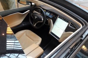
Don’t put touchscreen technology in the driver’s seat just because it’s trendy – designers of autonomous and electric vehicles need to pay more attention to what works best for drivers.
Buttons are making a comeback in automotive design! As a designer and driver, I welcome the news. Save us drivers from the current infatuation with complex touchscreen controls and infotainment that take our attention away from driving, our eyes off the road and our hands off the wheel.
With their detailed menus and lack of haptic (sense of touch) cues, touchscreens were never a good idea for automotive controls. I wrote about my concerns with the safety and functionality of touchscreens back in 2016, and my feelings haven’t changed. Vehicle designers allowed “cool” tech to take the wheel and relegated any misgivings to the back seat.
“Don’t put technology in the driver’s seat; let user needs drive decisions.”
Touchscreens became synonymous with “high tech” and have been embraced by designers for luxury brands and electric cars. But after a few years in the cockpit, it seems consumer opinion is shifting the focus back toward physical buttons, dials and sliders.
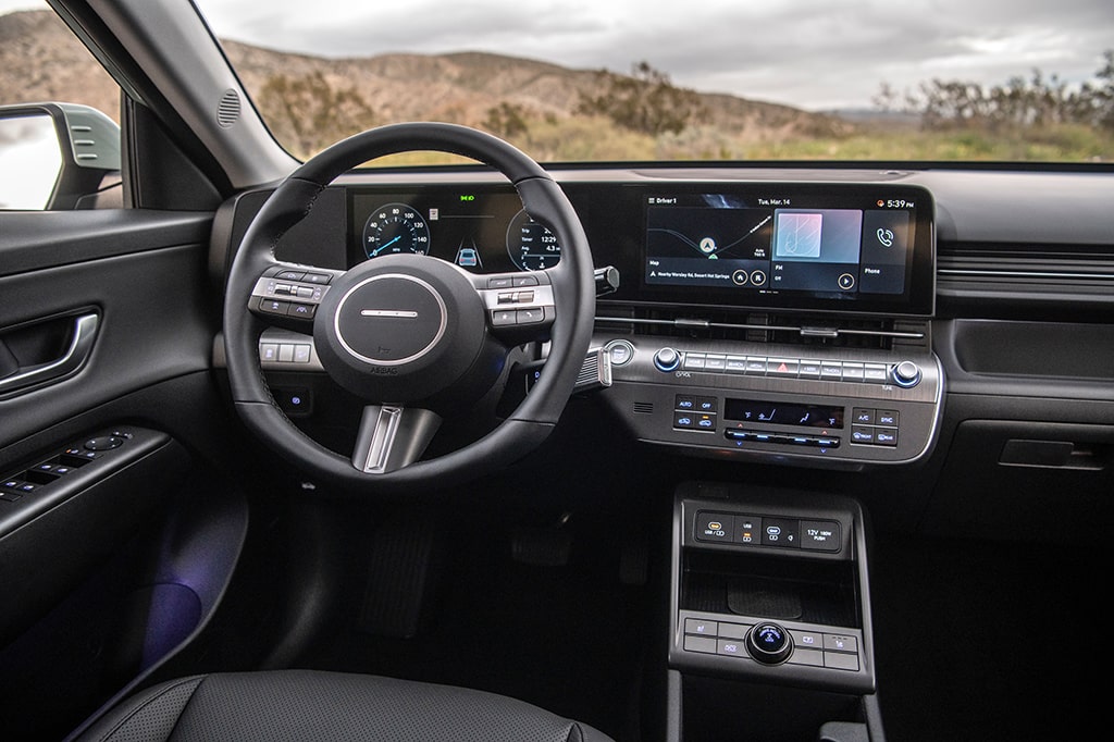
Slate, an online pop culture magazine, reports that Porsche, Volkswagen, Nissan and Hyundai have announced a return to (or a commitment to stick with) knobs and buttons. According to Slate, the pull-back from touchscreens is the result of consumer backlash. It’s no wonder: Navigating through multiple menus just to adjust the temperature of your vehicle is frustrating.
Touchscreen-based infotainment systems can also be a distraction for drivers. How did we end up in a situation were using your smart phone while driving is illegal, but using Android Auto on a larger screen is okay?
Realistically, voice control still requires the driver to look at on-screen prompts, and with no haptic cues, flat screens also require eyes on the task. From a usability standpoint, the clunky controls on older vehicles had a few advantages over modern infotainment systems. The controls were simple, options were limited, and tasks could be completed with a quick glance and reliance on haptic input. The tactile feedback of real buttons and switches allowed drivers to keep their eyes, and their attention, on the road.
It’s like auto designers have ignored the tactile aspects of good design.
Veering into behavioural science, we find other usability challenges related to touchscreen vehicle controls. With a screen interface, designing an intuitive user experience is more challenging because there are fewer visible structures with which to interact. Touchscreens have a low degree of affordance due to their lack of visual cues. Will the system accept gestures to zoom or rotate the navigation screen? What about voice commands? Should you swipe up to get to the main screen or find a “back” arrow?
Autonomous vehicles require a different user experience

There’s a lot of trial and error with menu-driven controls because the interface is streamlined, and much of the information infrastructure is hidden. For advanced vehicles with autonomous driving features, the learning curve will be steep. The judicious use of human-centred design principles would greatly ease adoption.
At a news event for a new Kona model, Hyundai’s head of design, Sang Yup Lee, confirmed his company’s commitment to buttons. He feels safety-related functions should definitely be accessed by physical controls, such as knobs or buttons for climate control and volume.
However, Lee noted that his company may rely more heavily on touchscreen controls in vehicles with Level 4 autonomous driving capability.
He’s right to make that distinction. The user experience should be completely different for self-driving cars. Autonomous vehicles have sparked a re-imagining of everything from vehicle ownership models to interior seat configuration to control interfaces.
For now, personalization and flexibility are still the name of the game for automakers, but these features should be incorporated in a thoughtful way that reflects the actual needs and requirements of the user. With electric vehicles in particular, designers should resist gimmicks that don’t serve the user (gesture controls?) and embrace the useful and unique aspects of an electric car, like being able to use the vehicle’s battery to power external devices.
Effective design of advanced vehicles goes well beyond tweaking the UX of the touchscreen. It will require extensive user research, usability studies and behavioural science expertise that extend beyond the traditional confines of the automotive sector.


