By Scott Smith
When a “top task” analysis revealed $200 million in lost revenue opportunities, user-centred design and task performance became strategic goals for this tech company
Working with a large team in a Fortune 100 high-tech firm, we validated four website design strategies to improve usability and proved the benefits of a top task management approach. The company adopted strategies to:
- focus on their customers’ top tasks (user-centred design),
- measure success in terms of top task performance,
- understand the why behind customer behaviour, and
- engage in a process of continuous improvement.
These steps enabled the firm to significantly improve their customer experience, and to quantify a $200-million benefit in doing so.
Strategy 1: Focus on users’ top tasks
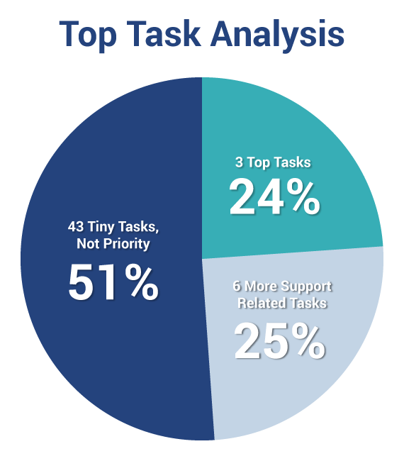
The first step was conducting a task identification project. Users visiting the website were presented with a randomized list of carefully prepared potential website tasks and asked to vote for the tasks most important to them. As in all our task identification studies, we found what we call a “long neck” – a small number of tasks that account for a disproportionately large percentage of the vote. At this organization, just three tasks accounted for 24% of the vote for top tasks. These tasks provide a common goal for internal stakeholders because they touch on many organizations within the company.

Knowing the top tasks of their customers allowed the company to really focus their resources on what is most important to their customers. They started emphasizing and refining top task links and minimizing or eliminating tiny task links.
In addition, they made organizational changes. They assigned managers responsibility for improving top task performance and created facilitation teams to help refine some of the generic services affecting top task performance. For example, one team was formed to refine site search and another team to refine the product taxonomy.
“The team focus changed from managing content to managing task performance. They started measuring actual task performance – not page visits, bounce rates and other common web metrics.”
Strategy 2: Measure top task performance
Opportunities for improvement became clear as soon as we started testing top task performance. The main culprits preventing task completion were confusing menus and links, poor search results, outdated content, and organization-centric terminology.
In one test with partners and resellers we found that 54% of the top tasks ended in failure. Less than half the people who attempted a top task were able to complete it. The disaster rate was 12%. These people thought they had completed the task successfully but actually got it wrong. For example, they may have downloaded the wrong software or found the wrong procedure for troubleshooting a product.
Additional data collected by the company indicated that out of 25,000 new registrations on the website that year, 81% had never completed a single transaction.
The company estimated the lost revenue could be as high as $200 million per year from people not being able to complete their tasks.
Task performance testing was conducted with existing customers, new customers, people who frequently visited the website, and people who were relatively new to the website. Some testing provided baseline performance measurements, so we knew the success, failure and disaster rates plus the task completion times associated with each of the top 10 tasks. Other testing focused on understanding why some people were successful, and others failed.
Testing task performance has significant payoffs. In this case, it enabled us to quantify and focus on failures in registrations and transactions that amounted to a $200-million opportunity.
With this latest case, blaming the individual has gone one step further, to the criminalization of medical error. Should a human error be treated as a criminal offence if we know the appropriate systems are not there to support critical decisions made under duress?
Currently, nursing roles are often short-staffed, there is more and more information coming at them, and they are under extra pressures from the pandemic. Existing systems could be doing more to prevent errors and ease workloads. Rather than spending time and effort on convicting someone for a mistake, wouldn’t resources be better spent on preventative measures within healthcare systems?
Strategy 3: Understand customer behaviour
We remotely observed and measured people performing top tasks in their typical work environment. We quickly found opportunities for improvement. Some were as simple as just helping people get started in the right direction. A mega menu was revised to provide more immediate support for the top tasks and a new product selection mechanism was developed.
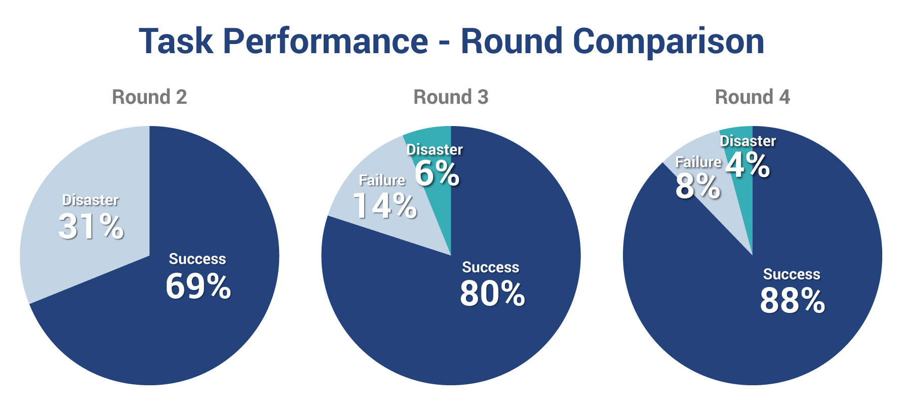
We conducted four rounds of testing, analysis, and refinement over an intense four-week period. During each iteration, we tested the same top tasks with new groups of 8 to 10 people. People were asked to think aloud so we could gain insight as to what they found confusing or unexpected. Anything that negatively affected performance for more than half the people was examined to see what could be improved. Changes included things like eliminating extra steps, improving link labels, repositioning content, and eliminating redundancies.

Design decisions became much easier to make once we understood why people were encountering difficulty. We knew what we had to eliminate, change, edit and reposition, without wasting time on internal debates based on opinion. We were driven by the data. The results reinforced and validated our design decisions. In the last three rounds of testing the success rates climbed from 69% to 88% and the disaster rates dropped to below 4%.
User-centred design delights customers
Customers have been delighted with the improvements. Several people have commented that the new mega menu provides them direct access to more than 80% of their top tasks. This mega menu is omnipresent throughout the website. Moreover, people who used the new product selector mechanism experienced none of the difficulties associated with the previous, hierarchical mechanism. They got to the product family of interest in two clicks.
More recently, we’ve been looking at the strategies with which customers start each task and noting which strategies end in success. For example, navigating from the mega menu versus the support main page or using site search versus a dedicated downloads search. Then we rework the design to minimize or eliminate ineffective strategies while promoting or guiding people down the path most likely to succeed.
Major changes by the search team, focused on the top tasks, have also pleased customers. In many cases, entering a specific product name or number leads to the top organic search result being the main product support page with sub-links to the top tasks of downloading software and troubleshooting.
Other opportunities for user-centred design are afforded by thinking about common follow-on tasks or related activities and offering them at the appropriate time. For example, once someone has located their product and downloaded a software update, offer to keep them informed of future updates. Since they are logged in, the system already knows the product of interest and their email address. Nothing else is required.
Strategy 4: Engage in a process of continuous improvement
Companies who have taken a top task management approach have seen significant improvements in task performance and customer satisfaction. Several next steps can help to evolve the strategy:
- Re-organize both responsibility and rewards to focus managers on managing tasks, not content
- Evaluate content creators based on their content’s impact on top task performance, not on quantity produced
- Allocate as much time (or more) to removing redundant, outdated and trivial (ROT) content as to generating new content
- Budget for continuous improvement of the website as an ongoing operational expense, as opposed to project expenditures that may be cut
- Create performance metrics for self-service in the same way you have metrics for your support center – make the costs of poor task performance visible
Continue to apply the four strategies mentioned above:
- Know your top tasks
- Measure top task performance
- Understand the why behind customer behaviour
- Engage in a process of continuous improvement
Above all, manage your customers’ time on your website. Time is the currency of the web and saving your customers time will reap significant benefits, for you as well as for them. Online, the customer experience IS your brand, your sales, and your marketing.
Talk to us if you want to improve user experience using a top task management approach, paired with a rapid process for customer experience evaluation and refinement.
Related: Read how Cisco reduced demand for technical support by using top task analysis to make its web resources more user-focused.


