One of the tools often used by DFFRNT to improve user experience is top task management. In large organizations, top task analysis clarifies where resources should be allocated and puts the focus on the user. For Cisco, working with experts in human-centred design to improve the company’s website prompted organizational change with clear bottom-line results. Task completion increased; the number of technical support tickets dropped.
The client
Cisco is a global company specializing in the infrastructure that powers the Internet. People in IT see their logo everywhere. Cisco’s products provide the connectivity behind email, office computer networks, data storage and the Internet of Things.
The company expanded rapidly from 1995 to 2015, supporting the explosive growth of the Internet and ethernet. What was a $1-billion company in 1995 had a market capitalization of $173 billion at the end of 2020.
But even giants in their field need help sometimes. Several years ago, Cisco called on strategic design consultants to help improve user experience, identify clients’ top tasks, measure the company’s performance, and improve it.

“Every one of DFFRNT’s clients is looking for a way to prioritize, a way to optimize their use of time and resources. Top executives trying to improve the user experience have many silos to deal with because in a large organization, no department or silo is solely accountable to the user. DFFRNT brings the focus back to their goals.”
Scott Smith
DFFRNT
The challenge
Cisco had undergone explosive growth in the preceding decade and has an extensive product line. The company was looking to improve customer support offered via its website but needed a company with expertise in optimizing the user experience to guide the changes.
Most Cisco customers seeking technical support are doing so in a high-pressure context, such as a network technician or system architect who needs to download a software update or find product documentation. Ease of use is essential in these situations. The Cisco website incorporates a mega-menu (a drop-down menu with a large number of options) which was not serving users well.
The solution
Neo Insight was tasked with helping Cisco provide better outcomes for internal and external customers.
The poor performance of Cisco’s website as a customer support channel resulted from a lack of focus on the user, the user’s language, and the sub-tasks the user would need to perform.
Employing data-driven design tools, Scott Smith and his associates performed top-task studies and monitored the continuous improvement efforts related to these tasks using task performance indicator measurement.
The TPI is a surveillance tool, similar to the more familiar key performance indicators (KPI), except at a task-specific level. In order to routinely monitor the performance of the site, we conducted a TPI study every quarter. We selected 10 support tasks that are tested each time so that we can identify improvement against a benchmark.
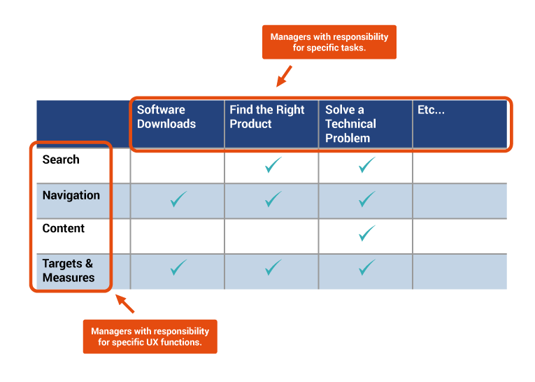
Top tasks tend to touch a lot of different departments within a company. Cisco had “silos” within its organization. As an outside consultant, producing hard evidence, Neo Insight was able to organize and motivate teams across silos to better support a key type of Cisco customer: network technicians in the field.
“At Cisco, design decisions needed to better support users’ top tasks,” says Smith. “We are usability experts. The principal need was for us to quantify user tasks, measure user performance on them, and focus corporate decisions on what is important to users.”
“By representing the user at a management level across silos, we drive organizational transformation.”


The results
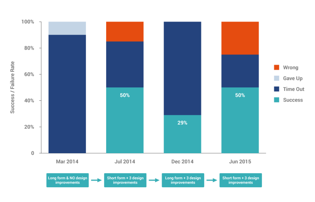
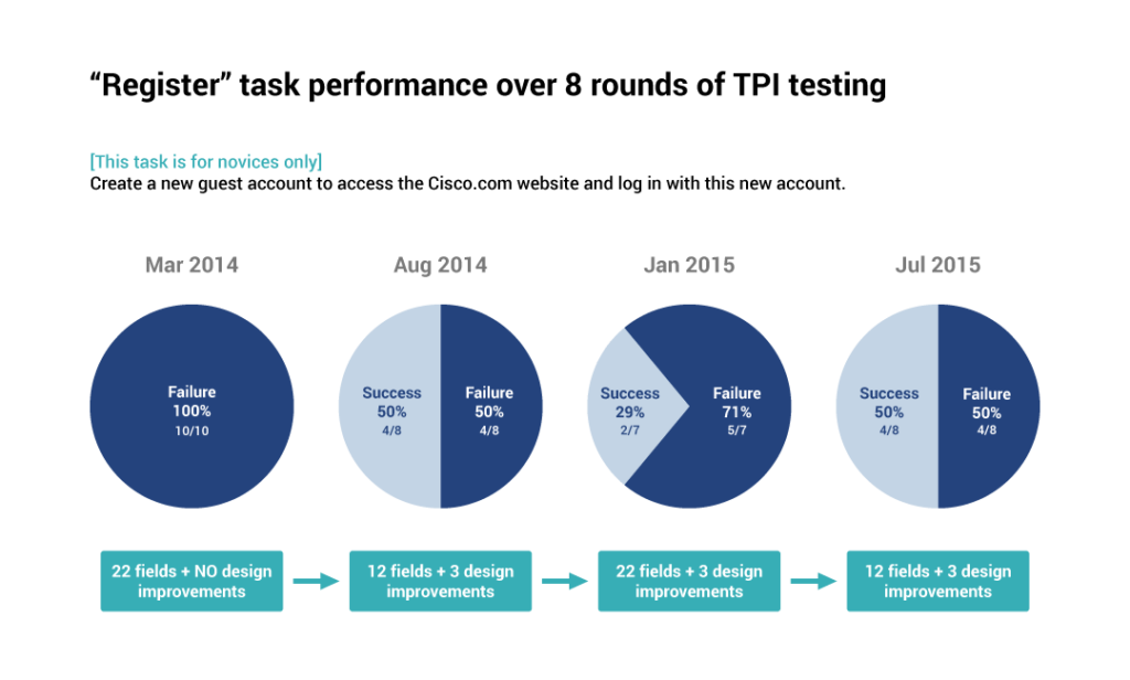
There is a compelling business case for human-centred design. At Cisco, for the specific task of registering a new user account, the design improvements had measurable positive outcomes:
- registration completion doubled between Q1 of the fiscal year 2014 and Q3 of the fiscal year 2015,
- the number of technical support tickets for registration dropped to less than half, and
- time to complete a registration was reduced by one-third.
As strategic design consultants, DFFRNT often sees immediate benefits from top task management. User success rises; support calls go down.
The outcome
Identifying the customer’s top tasks prioritizes actions for managers. Testing design makes it clear where they should allocate resources. Measuring the performance of users makes it easier for teams to judge their own performance.
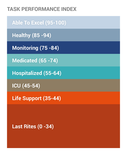
Once top tasks were identified, task performance was measured over time, as changes were implemented. At the beginning of this strategic design process, Cisco’s task performance indicator score was abysmally low at 23, on a scale of 1-100. Three years later, the company was on track to achieve a TPI score of 70.
This project was not just about website redesign. The ROI came from savings on the help desk operations. Top Task Management methods prompted organizational change with bottom-line results.


