In the early days of making databases available online, a federal government department wanted to improve its online user experience by presenting links to relevant labour market data, skills and training information, and job openings. The government made users hunt for related content rather than automatically pulling in data from more than one hundred databases. DFFRNT’s Scott Smith worked on the information architecture, mock-ups and business case for this digital transformation.
The client
The former department of Human Resources and Skills Development Canada (HRSDC) is a large federal government agency. It administers a wide range of benefits and services, and is the face of the Government of Canada services for many Canadians.
This department is now known as Employment and Social Development Canada (ESDC).

The challenge
Scott was part of the strategic design group evaluating options for enhancing HRSDC’s web user experience. The client wanted to offer consolidated labour market information gathered from disparate data sources.
The team validated stakeholder readiness, created a mock-up, and prepared an options analysis for a business case.
In the early stages of Government Online, the challenge was twofold:
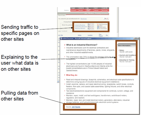
- How to use the context a user reveals by their searching and selections to retrieve content and deep links to a broad variety of information related to a job category. The challenge was to avoid forcing job seekers to click to many disparate databases. For the job seeker, this could be job openings, average salaries, certification or training options.
- How to use the user’s location, job context, etc. to display data or deep hyperlinks that bring the user directly to relevant sections of related websites as needed, using context-aware links. In one case, users had to click 22 times to find skills and training required for any particular job posting.
When users make navigational choices on a government website, they assume the government is paying attention. But government websites were not created to bring information to the user. They were assuming users would click to website after website, essentially re-selecting or re-entering search terms.
Job seekers were doing this hundreds of millions of times per year. Looking for jobs, training, and career content is one of the most important things to the economy, and the government had 160 data sources for job seekers.
Service redesign and testing is like printing money. It brings rapid payback. An investment in the user experience will improve the contact centre’s efficiency and its capacity to handle calls, because more users are completing their tasks. That saves time at the contact centre. Time savings can then be applied to prioritizing the next usability challenge.
Scott Smith
DFFRNT
The solution
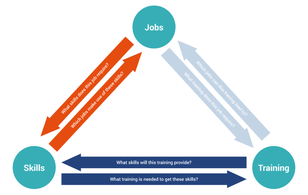
Scott and the team determined the users’ most common tasks, and then designed the website services around those tasks to enhance user experience. The mock-up and business case focussed on the top three information needs: skills, jobs, and training.
At the time, HRSDC had about 160 databases and systems. The team’s solution used National Occupational Classification codes as a “crosswalk” to connect information from the various databases without connecting the underlying systems.
In early usability testing of mock-ups, users linked to live websites. The team’s solution shortened paths through web pages that sometimes required many clicks and page-loads. In a worst case, users had to click 20 pages to finish their task.


The outcome
This project was a stepping stone to the current federal government Job Bank web application.
By iterating the business case alongside the design mock-ups, scenarios, and user validation, the strategic design team was able to refine success criteria as the conceptual user experience design evolved.
The strategic design experts at DFFRNT have found that improving user experience usually pays for itself within one fiscal year, by virtue of reduced demand for contact centre services. Generally, if users can initiate and complete a task online, it is much less costly to the organization than an interaction with a contact centre. Contact centres were happy to prioritize where to improve effectiveness or efficiency, and it allowed them to free up resources to save more money.
The results
The number of steps needed to accomplish certain tasks on the proposed website mock-up was greatly reduced. In some cases, the number of user steps shrank from 11 to 3.
The business case justified investing in more integrated web services to deliver better labour market information to the user.
The concept of this project has evolved into the present iteration of the federal government’s Job Bank application. Right now, if you visit Job Bank and provide just a job title and location, you will receive information about job openings, the local labour market for that position, the skills needed, the training available, the required certifications, and the rules for foreign workers in this position. All of this data comes from different branches of ESDC. The transformation was to bring relevant content directly to the user experience, rather than forcing job seekers to hunt and click.
Economist Don Drummond provided strategic context for the importance of this project. He believes the high-level economic goal of the job market is to help job seekers find a better job faster.
After the user-centric model became part of Job Bank, Drummond noted this tool “provides valuable information for Canadians looking for work or contemplating a job change. It contains information on occupations, job opportunities, education requirements, main duties, pay, employment trends and the jobs outlook.” (from “Wanted: Good Canadian Labour Market Information,” June 2014)
- Business case development and ROI
- Customer experience analysis
- Service design: Conceptualization, mock-up, and architecture
- Iterative concept validation and usability testing
- Digital transformation
- Strategic design


